|
Design is important because it adds aesthetic, which can draw users in and make them more interested, into a game. Take for example: 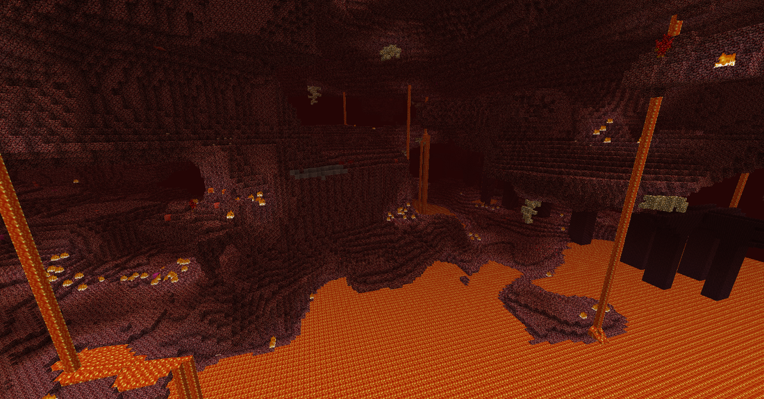 “Ile Wiesz o Innych Światach z Minecrafta.” SameQuizy, 19 June 2017, samequizy.pl/ile-wiesz-o-innych-swiatach-z-minecrafta/. This is the nether. It provides an example of an analogous color scheme, as its primary colors are reds, oranges, and yellows. This creates a feeling that you're in hell, what with all the fire and lava and literal Blood-stone covering the scorched land. This place feels burning fire hot, and that is the whole point of the place. Complete with giant Ghasts shooting fireballs at the player and zombie pigmen defending their hordes, as well as the rare nether fortress with blazes and wither skeletons. The Nether is a foreboding place that no one in their right mind would want to stay in for too long. Because of this color scheme, the player in this realm might feel anxious. This is caused by red and orange being big, popping, angry colors that can make people feel uncomfortable, except that red can also be associated with hunger. 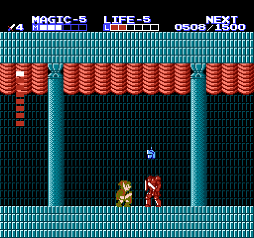 Hagopian, Mases. “The Adventure of Link Walkthrough.” Zelda Dungeon, www.zeldadungeon.net/the-adventure-of-link-walkthrough/. This is Zelda II, one of the most universally hated Zelda games for its difficulty and branch-off from the prevalent top-down perspective. Anyway, I digress. This palace is situated in the middle of Midoro Swamp, filled to the brim of crows, vultures, octorocs, and huge bugs, all hidden in the marshes and mud that slow Link down as he comes towards the palace. Inside the palace, however, its cool blue bricks create a mood shift as the player enters the lower levels. This simplification creates a more focused atmosphere that Link can easily spot and take care of enemies in more easily than other dungeons that are so colorful you can't help but get distracted. The boss, shown in the picture above, named, get this, "Helmet Head," is shown with a dark blue body, (although it is taking damage and shows in the picture as red,) creating a contrast with the surrounding blue, so that the player can easily distinguish and fight this boss. (To fight it, you have to jump and repeatedly slash at its head while the previous helmets come off and shoot fireballs at you.)
In conclusion:
Thanks for reading, and check your blind spot before switching lanes!
0 Comments
Ah, yes! I know just what to do.
Legend of Zelda, Link to the Past This was the first video game I have ever played. I remember being in my parent's room, sitting cross legged and clutching my sister's new GameBoy Advanced close to my face so I could see Link lifting and throwing bushes outside the castle. A few years later, when I would get my own GBA, I would actually be able to have some idea of what I was doing. But, at that point, I was 3, and anything was interesting at that point. Because of my memories as a small child, this has grown to be my favorite video game of all time. Anyway, LoZ, Link to the Past is a game released in 1992 for the SNES, and later 2002 for the GBA. It features new things like improved sprites, graphics, and a calmer playstyle than the previous two installments. This game is a little less open, having a mostly set path you ned to take as the player, but still more freedom to explore and do sidequests, with plenty of secret places to find. I don't want to spoil the game, so i won't talk about the actual gameplay itself. But, it can get annoying. Sometimes you can be overpowered by enemies and pushed off ledges like something from the movie "300." Or in other instances, a lot of bosses are really fast when you have almost defeated them. This makes it extremely stupid when you keep getting knocked off the ledge in a tower and have to climb your way up again and restart the whole fight. But, in conclusion
Now that I've had some time to calm down and realize what I'm doing with Photoshop, I think it's safe to say that I've done barely anything. I have barely created any art that isn't completely comic relief, or memes. I think that because of all my nonacademic work, though, I am slowly getting better at using Photoshop as an advantage giving tool. When I use photoshop, I always have fun, because of how cool the program is. I used to think that once a picture or a drawing was made, that was it. Nothing was available to add to it. But being able to use this software, I have come to think that I can be unstoppable. All I need is the toolbar. When creating something new, it is always essential to first have an idea of what you want to make. I, on the other hand, do not make good ideas. I have no idea whatsoever what I will do, and most of the time have 3 "projects" going at once. Don't do a me.
In summary of my Brain Dump,
Thanks for reading, and wear your seatbelt! In this past "week," we learned about colorizing images. I took an image of a dock and turned it from a bland black and white image to gray blue lake and sky, as well as a brown wooden dock. I looked at the final grade rubric, which told me that my choice in colors was not the keenest. I think it was the dock. It looked very dark against the water, but I liked the contrast, so I kept it. In future, I probably should not make it look so new. I think that because it looked so brown, like a freshly cut and chopped dock, that it probably made the image look less real. I also believe that I allowed my personal preference of contrast between colors came in between my sense of reality and my final product. 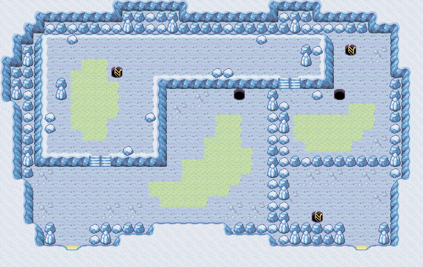 Google.com. (2017). Redirect Notice. [online] Available at: https://www.google.com/url?sa=i&rct=j&q=&esrc=s&source=images&cd=&ved=2ahUKEwjh7I-PyYfeAhUsTd8KHUosCscQjRx6BAgBEAU&url=https%3A%2F%2Fstrategywiki.org%2Fwiki%2FPok%25C3%25A9mon_FireRed_and_LeafGreen%2FSeafoam_Islands&psig=AOvVaw01_a1egp97yX3QQ3ilCK_B&ust=1539662819550264 [Accessed 15 Oct. 2018]. But, this is not the main topic of today's post. Sorry for the extremely long citation, but I had to go through several different websites to be able to create one for any of the images.
This is a cavern in the SeaFoam Islands, accessible from Fuchsia City in Pokemon Leaf Green. It is the bane of my existence in my goal of completing the Pokedex. Look closely at the cavern and you will see that everything is tinted blue. It's... ice. In a tropical archipelago... But, i have an explanation! Articuno, the Ice Bird, lives here. The GameDevs had to create an Icy environment to house this strange beast. Therefore, Ice. I think that they could have made it a combination of the normal gray and brown of previous caves mixed in, but it was the GameBoy Advanced, so they had to work with what they had. These blues created the mood of cold... burning, seething cold. Light blue, periwinkle, and a pale yellow are the main colors you see on screen as you enter this subfreezing cave. As you go deeper, you can feel the cold, creeping fear of meeting the legendary Pokemon Articuno... and this is what the blue symbolizes. That dread of having to face it is the reason to have light blue, a normally calming kind of color, used as something to make you anxious. In conclusion:
|
DISCLAIMER:The views and opinions expressed in this blog are solely those of the author and do not represent those of Durham School of the Arts or Durham Public Schools. Categories
All
Archives
March 2021
|
 RSS Feed
